Redesigning A Boarding Pass
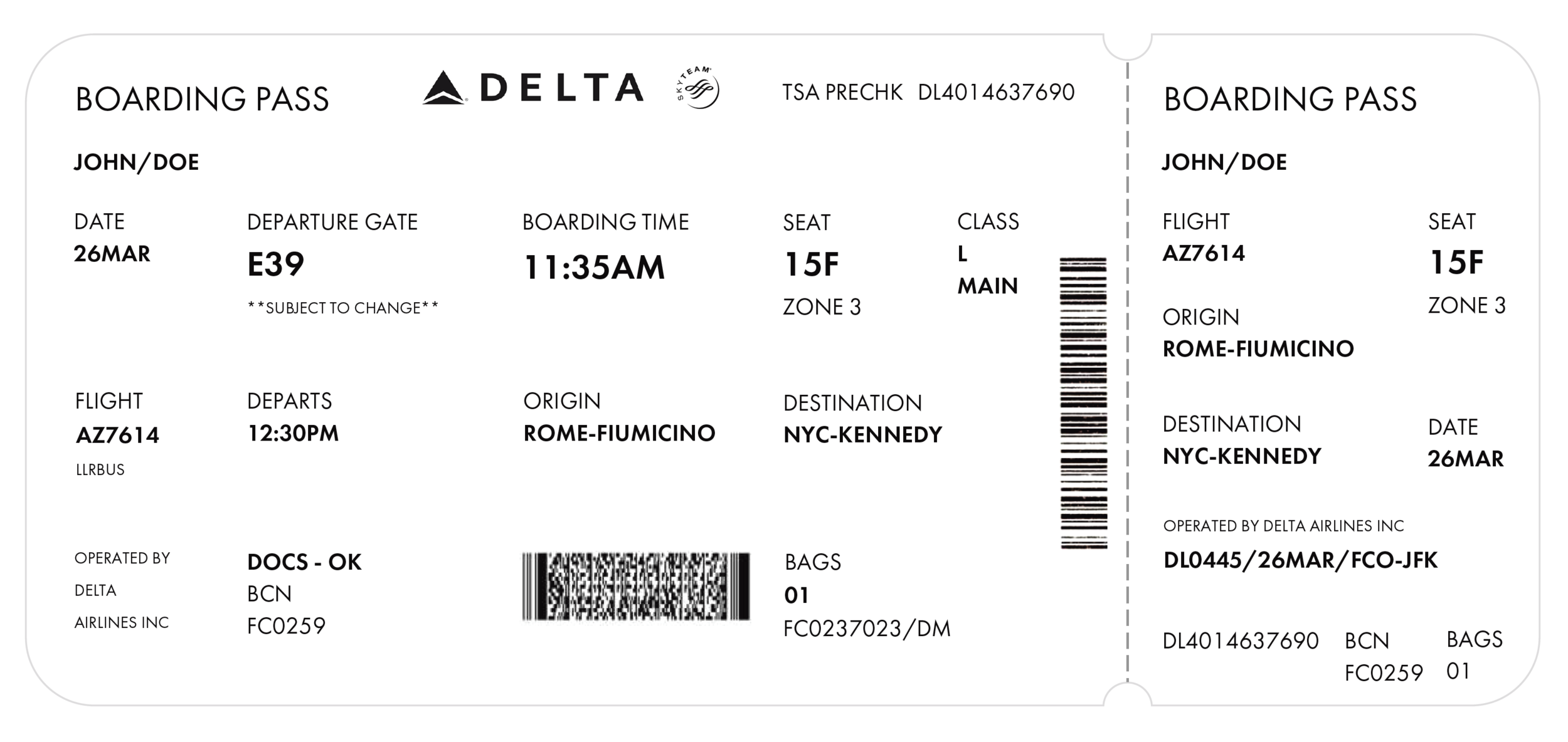
One of the many exciting projects I worked on was redesigning a Delta boarding pass. The original boarding pass was crunchy, with words overlapping, little or no hierarchy, and a lot of chaos to navigate through purposeful information.
To begin understanding the hierarchy, I printed down the text elements and began to number them as per the importance of the information they provide. In doing so, I understood that there are two ways in which the information could be organized, one is in the view of the passenger (left side of the boarding pass), and the other is to help summarize the information for the Delta crew (right side of the boarding pass).
For the type, I picked the family of Futura PT. In order to highlight the text I used Futura PT Demi and increased the font size of the information (size 21) that was of utmost importance to the passenger. For the rest of the information, I made use of Futura PT Book in font size 10 and 14. I also added a grid system to the boarding card, making the information more approachable and easy to read.
Yes, Delta needs a graphic designer!!!


